One of the most common issues we run into as editors is capitalization—starting certain words with a capital letter or using capital letters for entire words.
Editing for accessibility

I recently worked on a series of guides intended to help employers understand and comply with a new piece of legislation. My role included editing and formatting, with the final files being accessible Word documents and PDFs. As I worked through the process, I was struck several times by how beneficial it was to be involved early on, where I could make changes and help guide decisions that would ultimately lead to a more accessible end product.
As editors, we are advocates for readers—the people who use the documents we help produce. We offer a fresh look and an informed perspective on how authors can best convey their message to their intended audience. This includes everything from ensuring a document has a cohesive structure to correcting errors and clarifying meaning. Accessibility is another consideration. If a document is not created to be as accessible as possible, a significant portion of the intended audience may not be able to receive the message at all.
The accessibility landscape in Canada
Before getting started with accessibility, it is helpful for editors to understand the current accessibility landscape, including legislation and the responsibilities of content creators and publishers.
Perceptual disabilities
According to the National Network for Equitable Library Service, approximately 10% of Canadians have a perceptual disability, also known as a print disability. Perceptual disabilities include sight or hearing impairments that prevent someone from perceiving visual or auditory content, physical impairments that restrict the ability to hold or manipulate a physical book or document (such as Parkinson disease), and cognitive impairments that affect comprehension (such as dyslexia or ADHD).
Accessibility legislation
One of the first major Acts setting out accommodations for people with disabilities in Canada was the Accessibility for Ontarians with Disabilities Act, 2005. The Act requires that written information and other forms of communication be provided in an accessible format on request. Accessible formats do not need to be kept on hand, but they must be provided in a timely manner.
At a national level, the Copyright Act was amended in June 2016 to allow people with perceptual disabilities to access copyrighted works in more accessible ways. The amendments were written to align with and allow Canada to accede to the Marrakesh Treaty, which came into effect in September 2016. The Marrakesh Treaty sets international standards for copyright exceptions that allow print materials to be adapted into alternative formats (such as Braille or audiobooks) for people with disabilities.
In June 2019, the Government of Canada introduced the Accessible Canada Act, which aims to identify, remove, and prevent barriers faced by people with disabilities. The ultimate goal of the Act is to remove all such barriers by 2040.
Accessibility standards
As accessibility legislation has been enacted worldwide, a set of accessibility standards have been developed in parallel, notably the Web Content Accessibility Guidelines (WCAG). WCAG is a product of the Accessibility Guidelines Working Group, part of the World Wide Web Consortium’s Web Accessibility Initiative. WCAG 1.0 was published in May 1999, WCAG 2.0 in December 2008, and WCAG 2.1 in June 2018. A draft of WCAG 2.2 is scheduled to be completed and published in April 2023.
Although WCAG was developed as a standard for web accessibility, its use extends beyond the web. The World Wide Web Consortium Working Group has developed a note with guidance on applying WCAG 2.0 to non-web documents.
WCAG 2.0 is also an International Organization for Standardization (ISO) standard, ISO/IEC 40500. Other accessibility standards include PDF/UA (Universal Accessibility) and EPUB 3. PDF/UA is ISO standard 14289 for accessible PDF technology, and EPUB 3 is ISO/IEC technical specification 30135, a format for digital publications and documents.
The current WCAG standard, 2.1, has 13 guidelines, organized into four principles: perceivable, operable, understandable, and robust. Each guideline also has testable success criteria. “WCAG 2.1 at a Glance” has a summary of the guidelines and best practices covered by each principle. There are three levels of conformance: A (minimum), AA, and AAA. Government of Canada websites and web applications are required to meet WCAG 2.0 level AA.
How editors can help make documents accessible
So, how can editors help make documents accessible? The considerations fall under areas we’re already used to thinking about: structure, navigation, headings, styles, lists, punctuation, content, and visual elements. Here are some actionable tips for bringing in accessibility.
Structure and navigation
Metadata
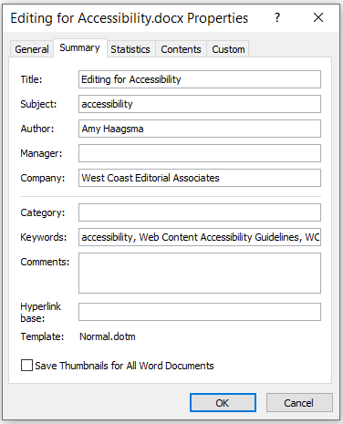
Accessible documents are required to include the document title, which is generally more informative than the file name. In Microsoft Word, you can add the document title in the document properties window (screenshot below). Additional metadata, such as author, subject, and keywords, can also be helpful in other contexts, such as providing information to internet search engines if the document is being made available online.
Navigation aids
To meet WCAG requirements for operability, a document must allow users to navigate and find content in multiple ways. The PDF/UA standard is more specific, setting out that documents over nine pages must have bookmarks—essentially a table of contents. A table of contents provides users with an overview of the document’s contents and structure and allows them to access specific sections and information directly. An index can also be helpful, as it allows users to find and access information in a way that other forms of navigation don’t, such as by name, subject, or concept.
Headings
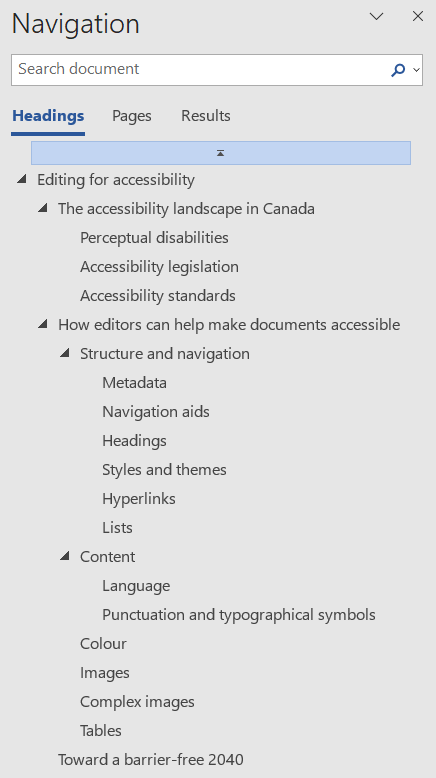
Headings are also important to document navigation. When heading styles are used, Microsoft Word’s navigation pane (screenshot below) displays the list and hierarchy of the headings and allows users to access content by heading. Some assistive technologies are able to access the navigation pane and/or a list of the document’s headings.
Heading levels must also be sequential. Heading 2 should always be followed by Heading 3, not Heading 4 or Heading 5. Skipping heading levels can be confusing for screen reader users, as it may indicate a problem with the device or that content has been missed.
Visually, headings should be styled so that sighted users can easily understand the document’s hierarchy. This is achieved through the use of formatting, such as font size, bolding, and italics.
Styles and themes
Another reason to use heading styles is that it allows users to change the styling based on their own needs—for example, if the fonts, text sizes, or colours used are not accessible to them. In addition to headings, styles should be used for captions, footnotes, and any other structural elements. Instead of bold and italics, use the “Strong” and “Emphasis” styles. Italics in particular can be difficult to read, so being able to change the “Emphasis” style to one that highlights the text in a different way can make for a better user experience.
To provide the most flexibility and accessibility, it is helpful to also use a theme, which sets out the styles for the document as well as the colour scheme. This allows users to change the entire look of the document. For example, if your brand colours are teal blue and lime green, you can define them in the theme colour palette; if those particular colours present issues for some users, they can change the theme to one that is more accessible. Colours that are not defined as part of a theme do not change when the user changes the theme.
Hyperlinks
Hyperlinks provide another way for screen reader users to skim a document, by navigating from link to link. For this reason, hyperlinks should be descriptive and should not rely on context from surrounding text. For example, “Click here to learn more about West Coast Editorial Associates” is not descriptive. “Visit West Coast Editorial Associates’ About page to learn more about our partnership” communicates where the hyperlink would take the user and what they would expect to find there.
For hyperlinks that are presented as URLs based on standard or expected styling (for example, in a reference list), add a ScreenTip to give screen reader users more information about the link. Allen Wyatt has a helpful guide for adding ScreenTips.
Lists
Lists should be created using Microsoft Word’s built-in numbered and bulleted lists, not manual numbering or glyphs, which prevents the text from being interpreted as a list by assistive technologies. Also avoid adding blank lines between list items, as this makes each list item a separate list.
Content
Language
One of the best ways to make your document accessible is to use plain language. Plain language helps you clarify your message and avoid ambiguity, and it respects your users’ time and attention. It also makes good business sense, because it reduces time spent on rework and answering questions. Most importantly, plain language considers who the reader is and what their needs are. For example, users of a document may have English as an additional language and/or low literacy. They may also have cognitive limitations. However, plain language benefits all users—even experts prefer plain language (see “Plain Language Is for Everyone, Even Experts,” by the Nielsen Norman Group).
Another consideration is ensuring that inclusive language is used—for example, language that is gender-neutral, free of racism and ableism, and non-violent.
Punctuation and typographical symbols
Another way meaning is conveyed is through punctuation and other typographical symbols. There can be a considerable difference between similar-looking symbols, and it’s important to use the correct symbol to aid users of assistive technologies in understanding the content. For example, there is a difference between a hyphen, an en dash, an em dash, and a minus sign. Hyphens are often not read by screen readers, which can lead to things like “My work hours are 9-5 Mon-Fri” being voiced as “My work hours are 95 monfri.”
To better understand the user experience, you can test your content with screen readers, such as NVDA, VoiceOver, and JAWS. The Google Chrome Developers YouTube channel has a video with a demonstration of NVDA that explains how to use the tool.
Colour
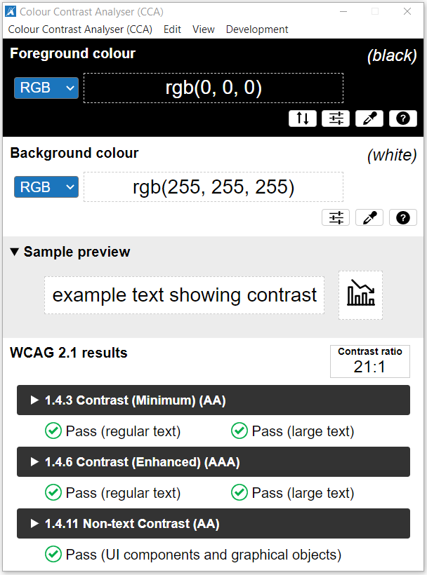
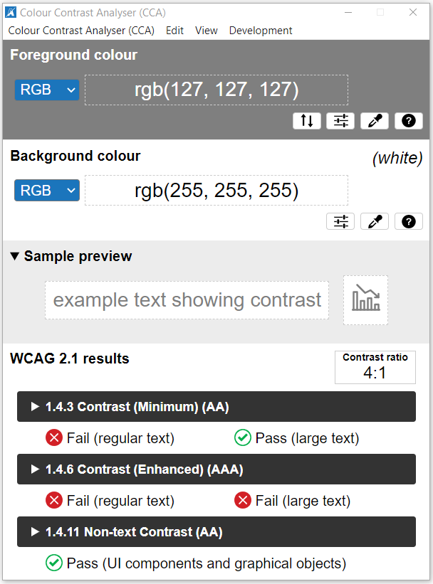
Another consideration is the use of colour, in particular the contrast between background and foreground colours. To meet WCAG 2.1 level AA, the contrast ratio for text needs to be at least 4.5 to 1 for regular text and 3 to 1 for large text (generally 18 points or 14 points and bold). Non-text elements also need to have a contrast ratio of at least 3 to 1.
To test the colour contrast, you can use a tool such as the TGPi Colour Contrast Analyser, which allows you to sample different colours from your document. Below are screenshots of tests using black text on a white background and 50% grey text on a white background. Black text gives a contrast ratio of 21 to 1, while grey text gives a contrast ratio of only 4 to 1.
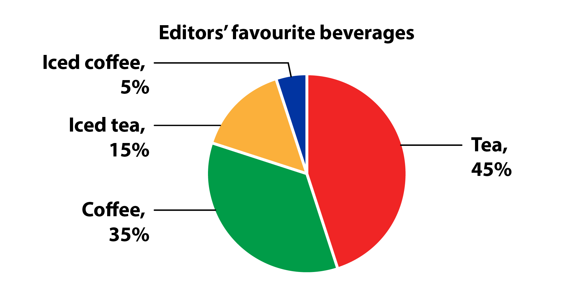
In addition to contrast, certain colours may not be accessible to all users, such as people with colour vision deficiency. Colour vision deficiency affects an estimated one in 12 men and one in 200 women. Most common (99%) is red-green colour vision deficiency. To understand how colours are perceived by people with colour vision deficiency, you can use a tool such as the Coblis Color Blindness Simulator. Below is a pie chart using red, green, orange, and blue, followed by a simulation of how the same pie chart would look to someone with protanopia, a type of red-green colour vision deficiency.
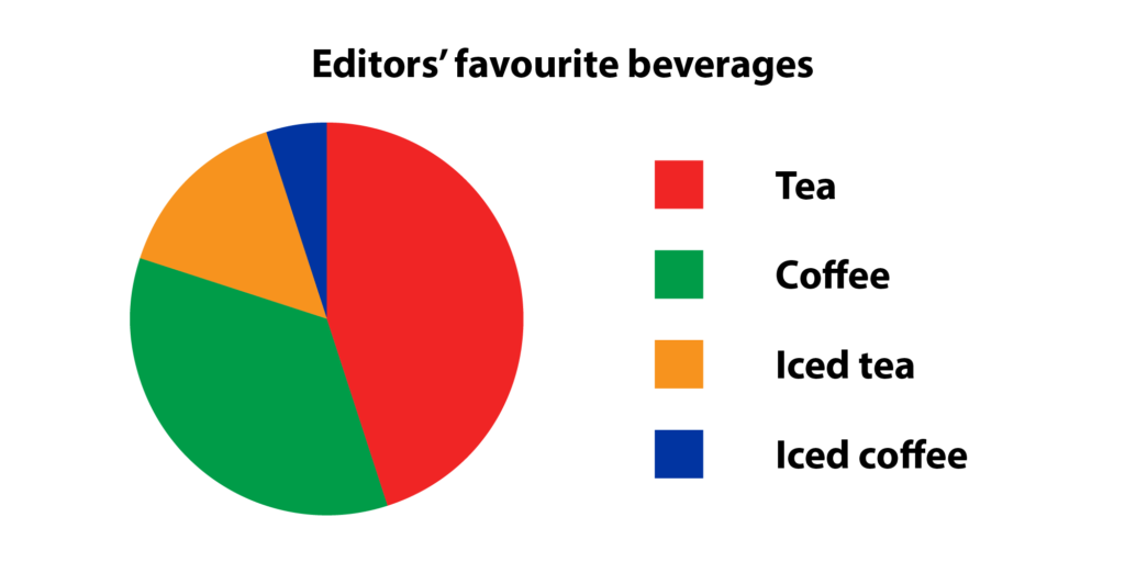
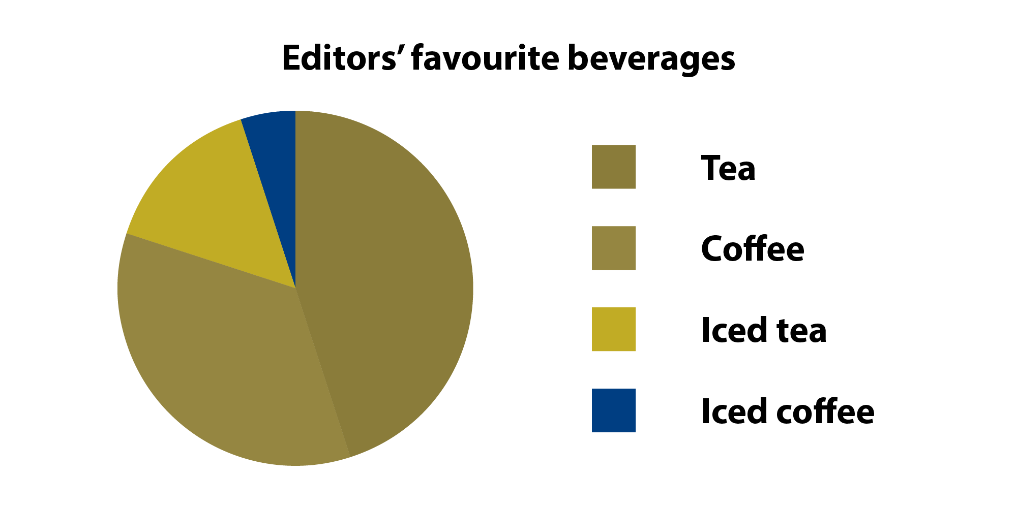
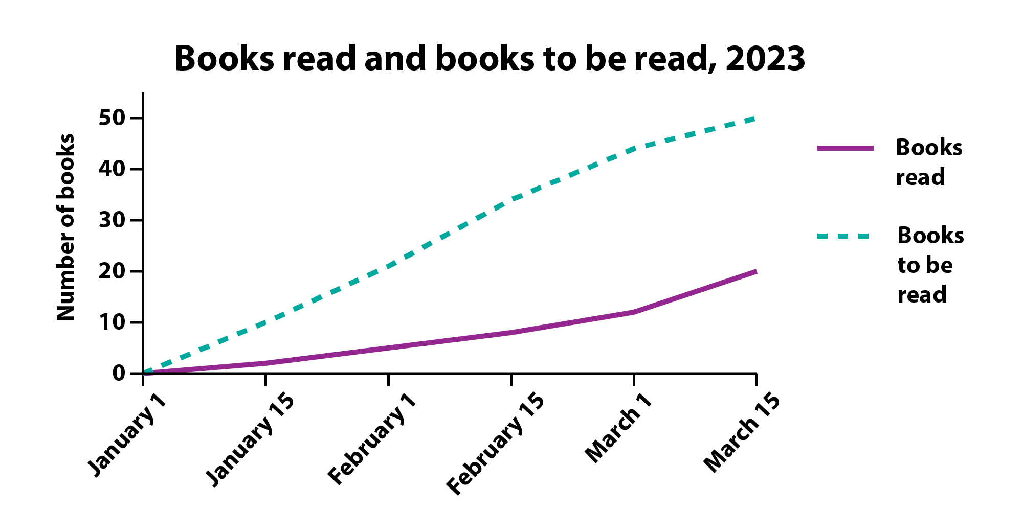
To account for differences in perception, colour alone should not be used to convey meaning or to distinguish different elements. For example, hyperlinks may be a different colour from surrounding text but should also be indicated by styling, such as underlining. A pie chart with different-coloured slices may benefit from outlines or dividers between the slices as well as labels, as in the first example below. A line graph could use a solid line for one series and a dashed line for the other, as in the second example below.
Images
Images may not be perceived by users with low or no vision; therefore, they must also be described using alternative text, or alt text. Alt text should describe the image as comprehensively yet also as concisely as possible. Images are announced as such by screen readers, so it is usually not necessary to include “A photo of” or “An illustration of,” unless the format provides important information. Alt text should be informed by the image’s context, purpose, and meaning. Start by describing the focus of the image; then add relevant details. Decorative images (for example, lines, shapes, and other design elements) should have null or empty alt text.
To add alt text in Microsoft Word, right-click on the image and select “View Alt Text.” Microsoft Word will also suggest alt text for you, although it is not typically very robust. For the image below of the West Coast Editorial Associates partners, Microsoft Word suggested the alt text “A group of people posing for a photo.” While not incorrect, it is also not overly helpful. Here’s a better option: “The eight partners of West Coast Editorial Associates standing together outside the Black Goose Inn in Parksville, British Columbia, wearing winter jackets, scarves, and toques.”

For more information on writing effective alt text, see this list of alt text best practices from Siteimprove.
Complex images
Complex images, including charts, graphs, and infographics, require many of the same considerations as other images, such as testing colour contrast and adding alt text. However, they are generally more difficult to describe succinctly. These types of images may also need a long description, which should be referenced in the alt text. For charts and graphs, this could include a table with the actual data points.
Tables
Tables should be simple, straightforward, and easy to interpret. This is especially important for people using assistive technologies. Column and row headers should communicate the contents of the data cells below and to the right, respectively. The first row should be identified as the table header, and rows should not be allowed to break across pages. Avoid having empty or merged header cells, which can lead to confusion in determining the relationships between header cells and data cells. A table with merged header cells can be remediated in a few different ways, including incorporating the merged header cells into the individual header cells or splitting up the table. Other best practices for tables include using tables only to present tabular data, not as design or layout elements, and using Microsoft Word’s built-in tables rather than tabs that mimic the structure of a table.
For more information on creating accessible tables, see “MS Word Accessibility – Tables,” from Queen’s University Belfast’s DigiKnow blog series.
Toward a barrier-free 2040
Although significant progress has been made in recent years, there is much work to be done to achieve the Government of Canada’s goal of being barrier-free by 2040. According to the National Network for Equitable Library Access, less than 5% of published works are currently available in accessible formats.
Editors have a unique role in and perspective of the publishing process as both an advocate for the reader and a bridge between content creators and end users. Even small steps can make a difference in improving accessibility and, ultimately, ensuring successful communication.
Related Posts


This Post Has 2 Comments
Comments are closed.
What a wonderfully informative article, Amy. I’m setting it aside for future reference. Thank you for your clear, easy-to-understand explanations.
Thank you, Arlene! I’m glad it’s helpful.