On a sunny, breezy evening in Montreal, my two daughters, my nephew, and I walked through the front door of an unassuming-looking restaurant named Onoir.
Words into (accessible) type
As writers and editors, we understand the importance of choosing the right words to communicate with our intended audience. Another part of communicating with our audience is how our words are presented on the page or onscreen. This is particularly important when our audience includes people with low literacy and those with cognitive disabilities, such as dyslexia, ADHD, and autism, or temporary cognitive impairments, as in the case of memory loss or a traumatic brain injury. Another consideration is an aging population—the older we get, the more cognitive challenges we face.
According to the Conference Board of Canada, 48% of Canadians 16 years of age or older have inadequate literacy skills. The International Dyslexia Association estimates that 15% to 20% of the population has a language-based learning disability, with dyslexia being the most common; more than one in 10 people are affected by dyslexia, according to the British Dyslexia Association. The Centre for ADHD Awareness, Canada indicates that approximately 1.8 million Canadians are affected by ADHD, including 4% to 6% of adults and 5% to 7% of children. The prevalence of autism spectrum disorder in Canada is estimated at 1% of the general population and between 2% and 3% of children, as recently reported in the British Columbia Medical Journal.
Accessible typography reduces cognitive load by making text easier to read and understand, thereby preserving mental energy. It also allows text to be read more quickly and decreases the need for rereading. This is beneficial for all readers.
So what are the considerations? The typefaces used, the formatting applied, and the spacing between different elements can all affect readability and, therefore, accessibility. As advocates for the reader, writers and editors are well positioned to bring these considerations to the forefront.
Typefaces
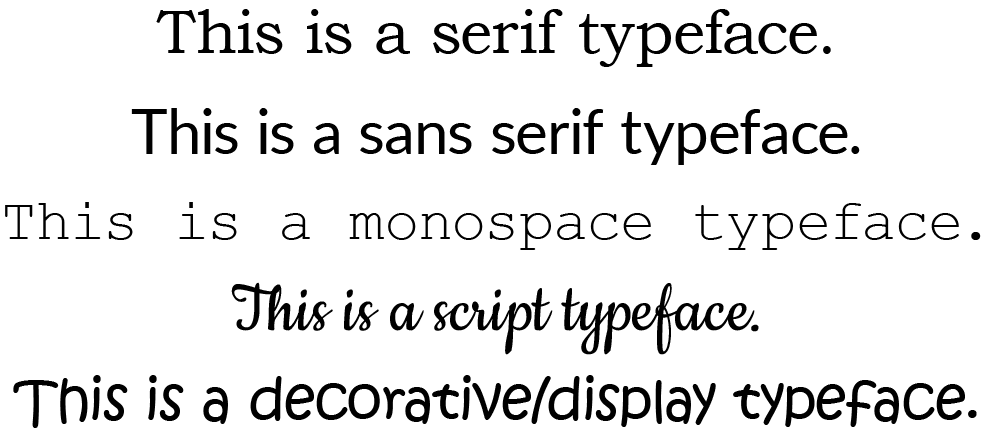
Although typefaces can be categorized in numerous ways, there are five basic groupings: serif, sans serif, monospace, script, and decorative/display. Typefaces with serifs, originally added to neaten the ends of letters carved in stone, are often thought to aid readability, especially in print. Sans serif typefaces are generally considered the most accessible for digital content because of their clean, simple letter forms. Monospace typefaces, which have equal-width characters, can make recognizing letter forms more challenging, but they have scored well in some testing. Script and decorative/display typefaces can be difficult to read and should be avoided for accessibility reasons, particularly in large amounts.
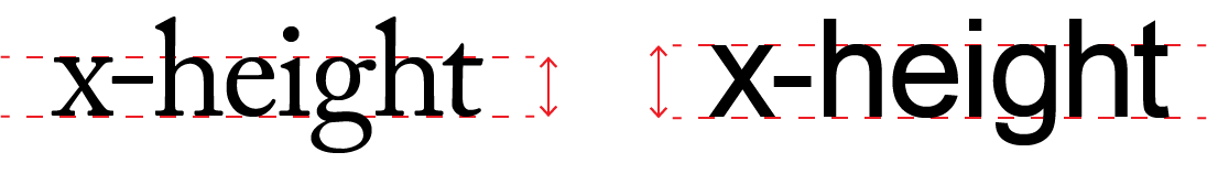
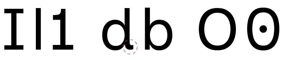
The way a typeface is constructed also affects its readability. Accessible typefaces tend to include distinct forms for mirrored letters (such as b and d) and characters that are easily confused (such as O and 0); wide, open counters (the spaces within letters like c, o, a, and e); and a high x-height (the height of a letter excluding ascenders and descenders), for easier readability at small sizes. Two typefaces that are both relatively easy to read at 11 points may provide very different reading experiences at 8 points. Letter and line spacing also affect readability more at smaller sizes.
Lexend
In 1999, Dr. Bonnie Shaver-Troup, an educational therapist, observed that reading comprehension issues were masking her clients’ true capabilities. Theorizing that this was due to typographical factors, she began testing different text formats to determine the factors that optimized visual-processing capabilities. She found that reading performance improved through the use of a sans serif typeface to reduce cognitive noise, wider letter forms to improve character recognition, and expanded character spacing to increase lag time and reduce crowding and masking.
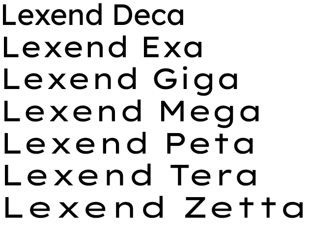
This led to the development of Lexend, a specially designed typeface aimed at improving reading performance. Lexend was found to benefit a large sample of students, but there was no one setting that worked best for all students. Therefore, Lexend was created as a collection of seven different typefaces, each with different character widths and spacing. In 2017, Dr. Shaver-Troup worked with Google to develop a variable version of Lexend, which offers precise control over size, weight, character width, and character spacing. The Lexend website likens this to getting a prescription for glasses: “Eyeglass prescriptions are not six strict settings. There are more granular settings possible.”
Inclusive Sans
A more recent addition to the accessible typography repertoire is Inclusive Sans, a typeface designed by Olivia King, available as a Google Font in both regular and italic formats. It aims to be friendly, contemporary, and widely usable while also being highly legible at the character level. Based on the principles of Reading Letters: Designing for Legibility by Sofie Beier and “A Guide to Understanding What Makes a Typeface Accessible” by Gareth Ford Williams, Inclusive Sans incorporates the following key features:
- There is a clear distinction between capital I, lower case l, and the number 1.
- There is a clear distinction between the letter O and the number 0.
- Character features have been added to letters that are typically mirrored.
- Counter forms are wider and more open in the letters c, o, a, and e.
- There is a clear difference in height between capital letters and ascenders.
- The x-height has been increased to make lower case letters easier to read at smaller sizes.
- Letter spacing has also been increased to help with readability at all text sizes.
Additionally, Inclusive Sans includes 48 glyphs to provide support for Australian Aboriginal and Torres Strait Islander languages. (King lives and works on Gadigal Country, in Sydney, Australia.)
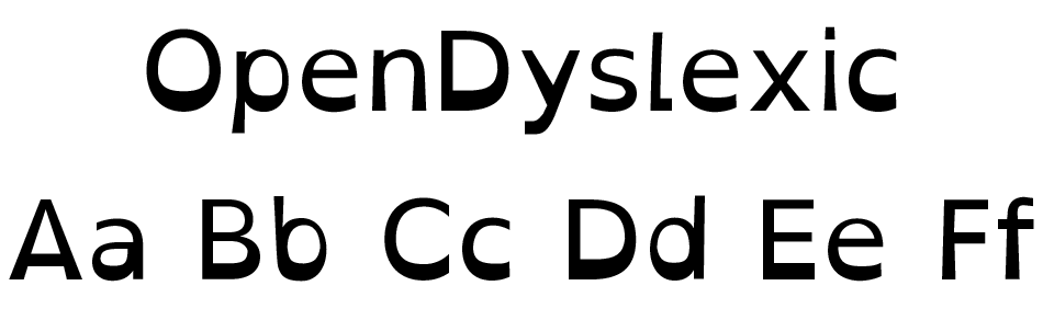
Dyslexie and OpenDyslexic
In 2008, graphic designer Christian Boer created Dyslexie, a typeface designed to counter some of the challenges faced with dyslexia, as his graduation project at the University of the Arts Utrecht. Boer has dyslexia himself and was inspired to design the typeface after struggling with studying while completing his degree. He observed that while it was difficult to distinguish letters and other two-dimensional objects, he could easily distinguish three-dimensional objects, leading him to initially design Dyslexie as three-dimensional characters. OpenDyslexic, a similar typeface, was created in 2011 by Abelardo González.
Both typefaces use similar principles: the characters have unique, distinguishable shapes, with large x-heights, open apertures, and large counter spaces; they don’t use mirroring or “look-alike” letters; and they have thicker strokes at the bottom to establish a clear baseline and prevent text from “swimming” around on the page.
In a study published in 2013, OpenDyslexic was tested against several standard typefaces, including Arial, Courier, Garamond, Times, and Verdana. While it scored well for reading speed, it scored poorly on fixation rate (the amount of time a reader remains fixed on a given character or word) and last in terms of reader preference. Despite this, both Dyslexie and OpenDyslexic have many supporters. Dyslexie has received several awards, including being named a finalist in Fast Company’s 2013 Innovation by Design Awards, and OpenDyslexic is available as a Google Chrome extension and an optional typeface on Wikipedia, Instapaper, Kobo’s eReader, and Amazon’s Kindle Paperwhite.
Comic Sans
Love it or hate it, almost everyone has an opinion on Comic Sans. Although academic studies are lacking, there is anecdotal evidence that Comic Sans can be helpful for readers with cognitive impairments, including dyslexia. The British Dyslexia Association’s Dyslexia Style Guide specifically recommends the use of Comic Sans, which it says can make letters appear less crowded.

Formatting
In addition to the typeface used, formatting applied to text can also affect readability. The Dyslexia Style Guide suggests using sans serif typefaces, which make letters appear less crowded, and a font size of at least 12–14 points, noting that some readers with dyslexia may prefer larger text. Similarly, it recommends avoiding underlining and italics, which can cause crowding and make text appear to run together, and avoiding capital letters in continuous text. Capital letters appear uniform and rectangular, which impedes our ability to recognize letters and words. Light or thin weights can be problematic as well, since the strokes can be difficult to perceive.
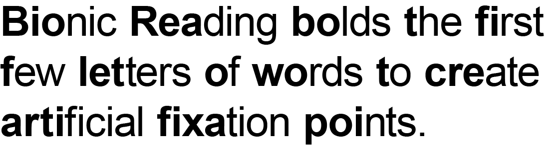
Bionic Reading
A unique way of formatting text, Bionic Reading bolds the first few letters of words to create artificial fixation points, allowing the brain to complete the word automatically and “skip over” the text—“similar to a surfboard that only glides on the tip of the waves,” according to the Bionic Reading website. It aims to make reading easier and improve both reading speed and comprehension. The amount of fixation (how much of the word is bolded), saccade (how many fixation points are bolded), and opacity (how visible the fixation bolding is) can all be controlled by the user.
Although some preliminary research has been done on the effectiveness of Bionic Reading, the benefits are as yet unproven, and there is no solid evidence to demonstrate an increase in reading speed. However, there are many favourable reviews online, notably from people with ADHD.
Bionic Reading is available as an app from Apple’s App Store and Google Play and as a Chrome extension.
Spacing
Another consideration in accessible typography is spacing. In general, increased spacing improves readability by avoiding crowding, but excessive spacing can have the opposite effect. The Dyslexia Style Guide recommends setting character spacing (also called tracking) to around 35% of average letter width, with spacing between words at least 3.5 times the spacing between letters and line spacing proportional to word spacing, ideally around 1.5, or 150%. Justified text, where text is aligned both flush left and flush right, creates unnatural spacing between words, which impedes readability.
Key take-aways
Typeface, formatting, and spacing are all important factors in the readability and accessibility of text. While there are several best practices, reader needs vary, and something that helps one reader may not be beneficial for another. Ultimately, the best approach when creating a document is to use a format that can be modified based on user input, such as a Word document with customizable styles, a reflowable PDF, an ePub, or an HTML web page. This is consistent with accessibility best practices and guidelines, including WCAG 2.1 Success Criterion 1.4.4, which requires that text can be scaled to 200% without the loss of information or functionality, and WCAG 2.1 Success Criterion 1.4.12, which has similar requirements for spacing.
Related Posts