I is for illustrator, A is for alphabet
 Recently, my book club read H is for Hawk by Helen Macdonald. We discussed the book for the entire evening, a sure indication of a good read. At one point, Margaret, a former English teacher, opened the book at random and read the first paragraph her finger landed on. “I could keep doing this,” she said. “It doesn’t matter where you land—it’s brilliant.”
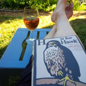
There is something else brilliant about this book—its cover. To say it is compelling states the obvious. But why is it? Chris Wormell, the illustrator, is an author in his own right. He writes and illustrates children’s books, many featuring animals, and several showcasing the alphabet and counting.
Julie Danielson, the brain behind Seven Impossible Things Before Breakfast, a blog about children’s lit, writes of Wormell’s work, “Strong lines. Gorgeous hues. Sheer artistry. Dramatic. Exquisitely-crafted. Elegant. Pitch perfect.” Glowing praise.
In her interview with him, Wormell reveals, “I’ve always been a bit backward-looking—inspired more by the past than the present—and, when I was a child, some of my favourite pictures were the little wood engraved vignettes of Thomas Bewick (1753–1828).”
That Wormell’s backward glance should hold such appeal today is testament to how enduring wood engravings and, more recently, linocuts are. For H is for Hawk, Wormell turned to the alphabet of William Nicholson. (My favourite is “A was an artist”—the only letter in past tense.) Of Nicholson’s An Alphabet, publisher William Heinemann wrote, “The simplicity of his method will appeal especially to the artist…. The parent will pleasantly conjure up reminiscences of quaint customs of the past, and the child will be fascinated alike by the bizarre attraction of colour and by the impressive types selected.”(from the Preface to An Alphabet, published in 1897).
Wormell, too, was impressed by Nicholson’s hand-cut type, and he “borrowed” it for Macdonald’s book cover. Unlike, Nicholson, who hand coloured prints for the first edition of his alphabet, Wormell carved his illustration in several lino blocks, inking them in muted tones.
In August 2014, the bookstore Waterstones Piccadilly asked Wormell to draw a large version of the cover on its window. The illustrator’s hawk had taken flight.
Related Posts